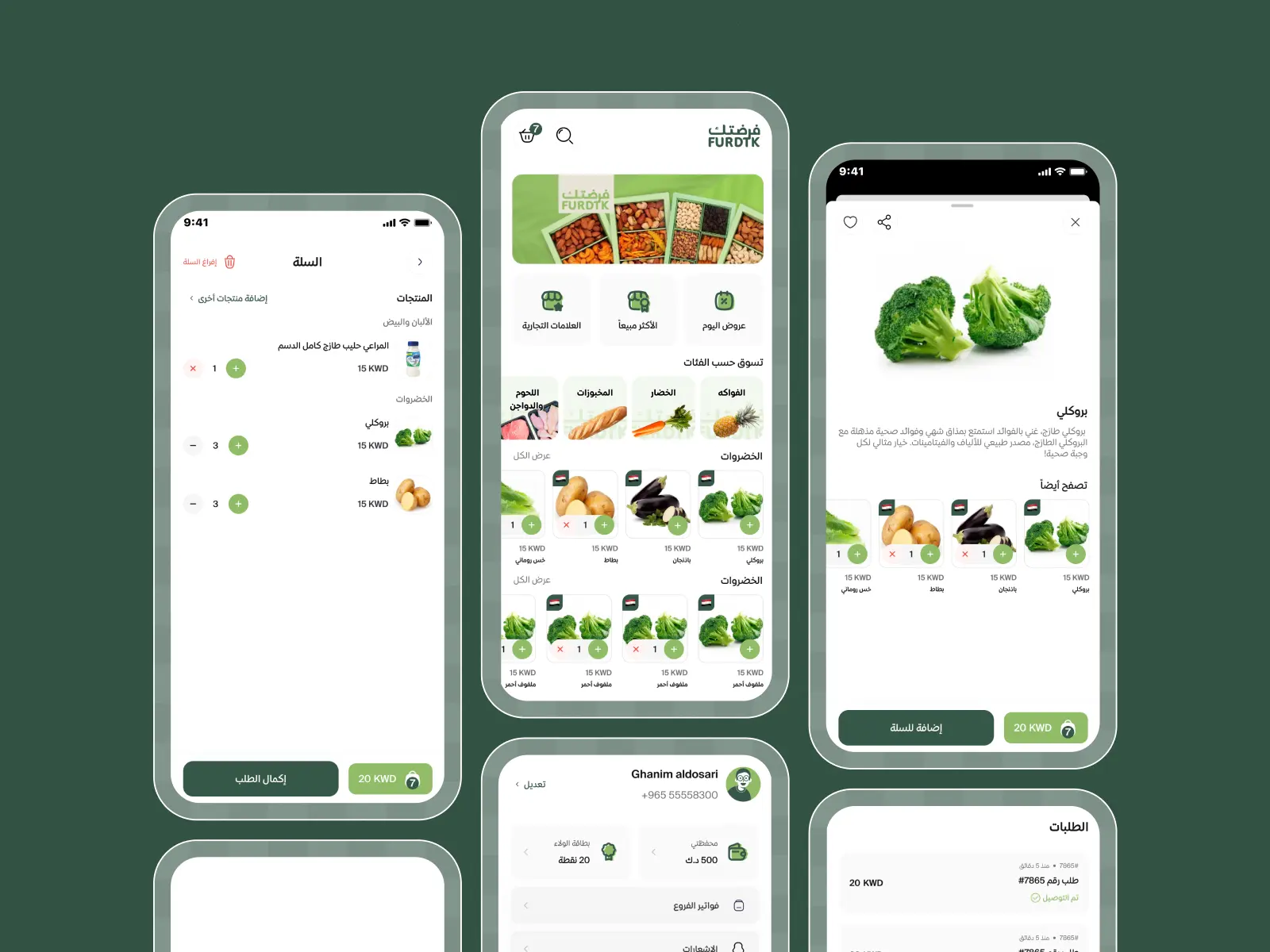
How Did We Redesign Furdtk Using the Agile UX Approach?
Phase 1 – Research and UX Audit
We began by conducting a full UX audit of the existing app:
- Identified key pain points from customer feedback and app store reviews.
- Analyzed user behavior through session recordings and heatmaps.
- Mapped out the current user journeys and pinpointed friction points in navigation, search, and checkout.
We then benchmarked Furdtk against global best practices in grocery e-commerce and created personas based on real user data.
Phase 2 – UX Restructuring and Wireframing
Based on our research, we restructured the app’s core experience:
- Simplified the navigation into clear categories and intuitive paths.
- Redesigned the product listing, filtering, and cart flow to be faster and more logical.
- Created wireframes for all key screens including home, product details, search, cart, and checkout.
This phase included user testing with prototypes to validate changes before moving into UI design.
Phase 3 – UI Design and Visual Identity
Once the structure was approved, we focused on transforming the brand visually:
- Developed a fresh, clean, and vibrant UI design inspired by nature and freshness.
- Selected a new typography system and color palette aligned with trust, freshness, and speed.
- Designed custom icons and illustrations for better communication and branding consistency.
All screens were designed for mobile-first and optimized for both iOS and Android.


.webp)
.webp)
.webp)
